Choosing the right colour for a headboard means thinking about the whole bedroom, not just the bed. The headboard is usually one of the main visual features in the room, so its colour can affect how calm, warm, bold or balanced the space feels. The best colour should work with the wall tone, flooring, bedding, curtains, blinds, furniture and natural light.
A headboard can either blend quietly into the room or become a clear design feature. A soft neutral fabric might create a restful, understated bedroom, while a deep green, navy, terracotta or charcoal headboard can add depth and character. There is no single best colour for every room. The right choice depends on the mood you want to create and the way the bedroom is used.
Because a headboard sits directly behind the bed, it also influences how the bed itself is framed. A carefully chosen colour can make bedding look fresher, make the wall feel more finished and help connect the bedroom’s soft furnishings. A poorly chosen colour can make the room feel disconnected, too heavy or visually flat.
Start With the Mood You Want to Create
Before choosing a headboard colour, think about how you want the bedroom to feel. Bedrooms are usually designed to support rest, but that can mean different things depending on personal style.
Some people want a calm, spa-like bedroom with soft colours, natural textures and minimal contrast. Others prefer a cocooning space with deeper tones, layered fabrics and a more intimate atmosphere. Some bedrooms need to feel bright and airy, while others benefit from warmth and richness.
A soft neutral headboard can make a room feel quiet and relaxed. A deep colour can make the bed feel more grounded and luxurious. A warm tone can create comfort, while a cooler shade can feel fresh and composed.
It helps to choose three words for the room before looking at fabric samples. For example:
- Calm, warm and natural
- Elegant, soft and refined
- Bold, cosy and dramatic
- Light, simple and restful
- Classic, tailored and timeless
These words can guide the colour decision. If the room should feel calm, a vivid or high-contrast colour may not be right. If the room should feel dramatic, a very pale headboard may not provide enough impact.
Should a Headboard Match the Walls?
A headboard does not have to match the walls exactly. In fact, a slight difference in tone often creates a more layered and interesting result. The key is deciding whether you want the headboard to blend in or stand out.
A headboard close to the wall colour creates a soft, seamless look. This can work well in smaller bedrooms, neutral schemes and rooms where you want the bed to feel calm rather than dominant. For example, a warm ivory headboard against a soft off-white wall can feel elegant and peaceful. A taupe headboard against a stone wall can create gentle depth without strong contrast.
A contrasting headboard creates more impact. This can work beautifully if the wall colour is pale and the headboard is deeper, or if the wall is dark and the headboard is lighter. Contrast helps define the bed and can make the headboard feel like a deliberate feature.
The level of contrast should suit the room size and style. In a small bedroom, very strong contrast may make the space feel busier. In a larger room, contrast can help the bed feel more anchored.
Matching can look refined, but it should not feel flat. If the headboard is similar to the wall colour, use texture to create interest. A woven fabric, velvet, linen blend or bouclé-style texture can stop the scheme from feeling plain.
What Colours Work Best for a Calm Bedroom?
Calm bedrooms often use soft, muted and natural colours. These shades are easy to live with and tend to support a restful atmosphere.
Good headboard colours for a calm bedroom include:
- Warm white
- Ivory
- Stone
- Oatmeal
- Taupe
- Soft grey
- Mushroom
- Pale sage
- Dusty blue
- Clay
- Blush beige
- Muted olive
Warm neutrals are especially versatile because they work with many bedding colours, timber tones and curtain fabrics. They can make a bedroom feel comfortable without feeling dark. Soft greens and blues are also popular because they feel connected to nature and often create a gentle, restful mood.
Grey can work well, but it needs careful handling. Cool grey may feel flat or cold in some bedrooms, particularly if there is little natural light. Warmer greys, greige and mushroom tones often feel softer and more inviting.
For a calm look, avoid colours that feel too sharp or highly saturated. Bright red, strong orange, vivid purple or very intense blue can be harder to relax with, although they may work as accents in cushions or artwork.
The most restful colours usually have a slightly muted quality. They feel softened rather than pure or bold.
When Should You Choose a Dark Headboard?
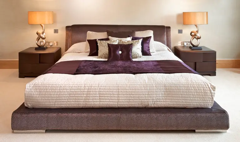
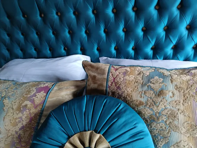
A dark headboard can be a beautiful choice when you want the bed to feel grounded, elegant and more dramatic. Deep colours often work well in bedrooms because they create a cocooning effect, especially when combined with soft lighting and layered textiles.
Popular dark headboard colours include navy, charcoal, forest green, chocolate brown, deep olive, burgundy and dark teal. These colours can make a bedroom feel sophisticated and intimate.
A dark headboard works particularly well when:
- The room has enough natural light
- The walls are pale or mid-toned
- The bedroom is large enough to handle visual weight
- Bedding is lighter or layered for contrast
- The fabric has depth, such as velvet or textured weave
- The room already includes darker accents in furniture, lighting or artwork
In a small bedroom, a dark headboard can still work if the rest of the scheme is balanced. For example, a deep green headboard with warm white walls, pale bedding and timber furniture can feel elegant rather than heavy.
Dark colours show shape clearly, so the headboard design becomes more noticeable. This is useful if you have a bespoke headboard with panels, curves, height or a shaped silhouette.
How Does Fabric Affect Headboard Colour?
Fabric affects how colour appears. The same shade can look very different in velvet, linen, cotton, wool or textured weave. This is why fabric choice and colour choice should be considered together.
Velvet gives colour depth and richness. A navy velvet headboard may look more intense and luxurious than the same navy in a flat cotton. Velvet also reflects light differently depending on the direction of the pile, so the colour may shift throughout the day.
Linen blends make colours feel softer and more relaxed. A green, beige or grey linen-look fabric often has natural variation, giving the headboard a more informal and calming feel.
Wool blends can make colour feel warm, tailored and matte. They are useful when you want sophistication without shine. Bouclé and heavily textured fabrics can make lighter colours feel more interesting because the texture creates shadow and depth.
Smooth fabrics can look clean and contemporary, but they may show marks or creases more easily depending on the material. Patterned fabrics can add personality, but they need to work with bedding, curtains and wall colour.
Always view fabric samples in the bedroom. Artificial showroom lighting can make colours look different from how they will appear at home. Morning light, evening light and bedside lamps can all change the tone.
Should the Headboard Match Curtains, Blinds or Bedding?
The headboard does not need to match curtains, blinds or bedding exactly, but it should coordinate with them. Exact matching can sometimes feel too controlled, especially if the same fabric is used everywhere. A more refined approach is to create a connection through tone, texture or colour family.
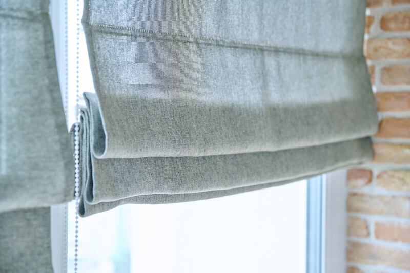
For example, a taupe headboard could work with warm ivory curtains, natural linen blinds and off-white bedding. A deep green headboard might connect with patterned cushions, a Roman blind with green detailing or artwork above the bed. A soft blue headboard could be balanced with neutral curtains and white bedding.
The aim is to create harmony without making the room feel overly matched. A bedroom often feels more luxurious when materials are layered thoughtfully.
Consider the following relationships:
- Headboard and curtains should not clash in undertone
- Bedding can provide contrast or softness
- Blinds can be quieter if the headboard is bold
- Cushions can repeat the headboard colour in small amounts
- Throws can bridge the gap between headboard and bedding
- Rugs can help ground the full colour scheme
If curtains are patterned, a plain headboard may be best. If the headboard is patterned or very bold, simpler curtains and bedding can prevent the room from feeling busy.
How Wall Colour Influences Headboard Choice
Wall colour has a major influence on headboard colour because the headboard sits directly against it. Even a beautiful fabric can look wrong if the undertone clashes with the wall.
Warm walls usually work well with warm headboard colours. Cream, beige, clay, oatmeal, warm taupe and muted terracotta can sit comfortably together. Cool walls often suit cooler or balanced tones such as soft blue, cool grey, sage or charcoal.
However, mixing warm and cool tones can work if done carefully. A soft blue headboard can look beautiful against warm white walls if the bedding and accessories connect the palette. A warm tan headboard can add comfort to a grey room if the grey has some warmth in it.
Strong wall colours need careful consideration. If the wall behind the bed is already dark or patterned, the headboard may need to be simpler. A headboard in a similar shade can create a tonal effect, while a contrasting colour can make the bed stand out more dramatically.
For wallpapered walls, the headboard colour should usually be drawn from the wallpaper palette or kept neutral. This creates a more cohesive finish.
Choosing a Headboard Colour for Small Bedrooms
In a small bedroom, the headboard colour can affect how spacious or enclosed the room feels. Lighter or softer colours often help the space feel more open, particularly if they are close to the wall colour.
A headboard in ivory, stone, oatmeal, pale grey, soft taupe or muted sage can add comfort without creating too much visual weight. These colours allow the bed to feel finished while keeping the room calm.
That said, small bedrooms do not always need pale headboards. A darker colour can work well if used intentionally. For example, a deep upholstered headboard against a matching or tonal wall can create a cosy, boutique feel. The key is to avoid too many competing contrasts.
In small rooms, texture can be more effective than bold colour. A pale textured fabric can add interest without making the room feel crowded. A vertical panelled headboard can also draw the eye upward, creating a sense of height.
Try to keep the wider palette controlled. If the headboard, bedding, curtains, rug and walls are all different strong colours, the room can feel smaller and busier.
Choosing a Headboard Colour for Large Bedrooms
Large bedrooms can usually handle more colour and contrast. A pale headboard may disappear if the wall is wide and the bed needs stronger definition. Deeper or richer colours can help anchor the space.
A large bedroom might suit a tall headboard in navy, olive, charcoal, chocolate, rust or deep taupe. These colours give the bed presence and prevent the room from feeling empty. If the room has high ceilings, a taller or more structured headboard can work especially well.
Large rooms also allow more layering. You can use a headboard colour that connects with curtains, rugs, cushions and artwork without overwhelming the space. A bolder fabric can become part of a fuller design scheme.
However, balance is still important. If the headboard is dark, use lighter bedding or soft textures to avoid heaviness. If the curtains are also dark, consider adding lighter walls, rugs or lampshades.
A large bedroom should feel comfortable, not sparse. The headboard colour can help create that sense of warmth and focus.
Should You Choose a Trend Colour?
Trend colours can be tempting, especially when they appear frequently in interiors magazines, social media or showrooms. However, a headboard is a relatively large feature, so it is worth choosing a colour you will enjoy for several years.
A trend colour may work if it genuinely suits your home and personal style. Muted greens, warm neutrals, earthy terracotta and deep blues have remained popular because they are versatile and liveable. Very bright or unusual colours may date more quickly.
A good approach is to use timeless colours for larger elements and trend-led colours for smaller accents. For example, choose a warm neutral, soft green or deep navy headboard, then introduce seasonal colours through cushions, lampshades or throws.
If you love a bold colour, consider whether it still feels right in the morning, evening and winter light. Some colours are exciting at first but become tiring over time. Others continue to feel comforting and personal.
The best headboard colour is not necessarily the most fashionable one. It is the one that supports the room and still feels right after the initial excitement has passed.
How to Test Headboard Colours Before Deciding
Testing is important because colour behaves differently in every room. A fabric sample should be viewed against the wall, bedding, furniture and window treatments before you commit.
Place the sample where the headboard will sit and look at it during different times of the day. Morning light can make colours appear cooler. Evening light and lamps can make them warmer. Rooms with north-facing light may make some shades look greyer, while south-facing rooms can intensify warmth.
Compare several options, but avoid testing too many at once. Too much choice can make the decision harder. Start with a small palette that suits the room’s mood, then narrow it down.
It can also help to look at the sample alongside:
- Wall paint or wallpaper
- Curtain or blind fabric
- Bedding
- Flooring
- Bedside tables
- Wardrobe finishes
- Cushions or throws
- Metal finishes such as brass, chrome or black
A colour that connects with at least two or three existing elements will usually feel more natural in the room.
Frequently Asked Questions
What is the safest headboard colour?
Warm neutrals such as oatmeal, stone, taupe, ivory and soft beige are often safe choices because they work with many wall colours, fabrics and furniture finishes. They also create a calm bedroom atmosphere.
Should a headboard be lighter or darker than the wall?
Either can work. A lighter headboard can feel soft and airy, while a darker headboard creates more contrast and presence. The best choice depends on the room size, wall colour and desired mood.
What colour headboard makes a bedroom look bigger?
A headboard in a similar tone to the wall can help a bedroom feel larger because it reduces visual contrast. Soft neutrals, pale greys, warm whites and muted natural colours often work well in smaller rooms.
Is a dark headboard a good idea?
A dark headboard can be a very good choice if you want a cosy, elegant or dramatic bedroom. It works best when balanced with lighter bedding, good lighting and complementary colours elsewhere in the room.
Does the headboard need to match the bed base?
The headboard does not always need to match the bed base exactly, but the two should feel connected. Matching fabric creates a tailored look, while complementary tones can feel more layered and relaxed.
Summary
Choosing the right headboard colour is about creating balance between the bed, walls, fabrics, furniture and the overall mood of the bedroom. Soft neutrals can feel calm and timeless, deeper colours can add drama and warmth, and muted natural tones can create a restful, design-led finish.
The fabric type, lighting and surrounding materials all affect how the colour appears. A shade that looks perfect on its own may not work once placed beside bedding, curtains or wall colour. Testing samples in the room is one of the most useful steps before making a final decision.
For tailored guidance on headboard upholstery, bespoke bedroom design and coordinated soft furnishings, Zenn Interiors can help you choose colours and fabrics that bring the whole room together beautifully.
Phone: 020 7871 3082
Email: zenninteriors@gmail.com
Find out more: https://zenninteriors.co.uk/